Don’t take it personally if visitors ditch your website within milliseconds – it’s astoundingly common. Studies show the average website only keeps a visitor for 15 seconds before they hit the back button or close the tab. So why do users leave websites so quickly, and what can you do to keep them hooked?
Reason #1 – Slow Loading Times
The number one reason why customers are leaving your website? Slow load times. Even delays as brief as one second lead to major drops in conversions and revenue.
Mobile pages that take over 3 seconds to load get abandoned by over 50% of users.
That extra second gives restless visitors ample time to bail. And according to research by Akamai, a 1 second delay could be costing you 7% of conversions.
Yikes! Those metrics underline why website speed is mission critical. Quick page loads aren’t just about keeping visitors from defecting to faster sites. Fast load speeds encourage visitors to view more pages and spend longer on your site.
What’s the fix to website abandonment? Optimizing images is a top place to start. Don’t just upload full-resolution photos without compression. Shrink images to proper display sizes – no one needs a 5000 x 3000 hero image for a website. Next, leverage browser caching and compression tools to slim down code. Upgrade to faster web hosting if needed. And don’t forget page-specific speed tests to locate problem areas.
Reason #2 – Poor Responsiveness
Another reason people leave a website? You might not be playing nice with mobile devices or resizing properly across browsers and screens.
With over 50% of traffic coming from smartphones, building a responsive mobile site is mandatory.
If your site serves up wonky text sizes, requires tricky zooming, or has details cut off on smaller devices – kiss that mobile audience goodbye.
Same goes for a desktop site that looks awkwardly tiny on a large monitor or has odd text wrapping on a petite laptop screen. Sites that force horizontal scrolling or hide navigation behind hamburger menus on wider displays also frustrate users.
Creating a site with flexible grids, textures, and components that reflow correctly takes work. But the payoff in sticking power and conversions makes responsive design well worth the effort.
Reason #3 – Wrong Audience
Ever visited an intriguing landing page only to realize the product or service wasn’t right for you? If a website fails to engage its intended audience from the start, no one sticks around, regardless of the quality.
Successful sites immediately display relevant messaging to their target demographics. That clarity comes from thorough audience research and personas during the planning phase. If your website tries speaking to everyone or makes inaccurate assumptions about visitors, they’ll quickly lose interest.
Who exactly should your content and messaging address? Avoid guesswork by getting crystal clear on the problems your product solves. Use analytics to see who is already visiting and refine your outreach accordingly.
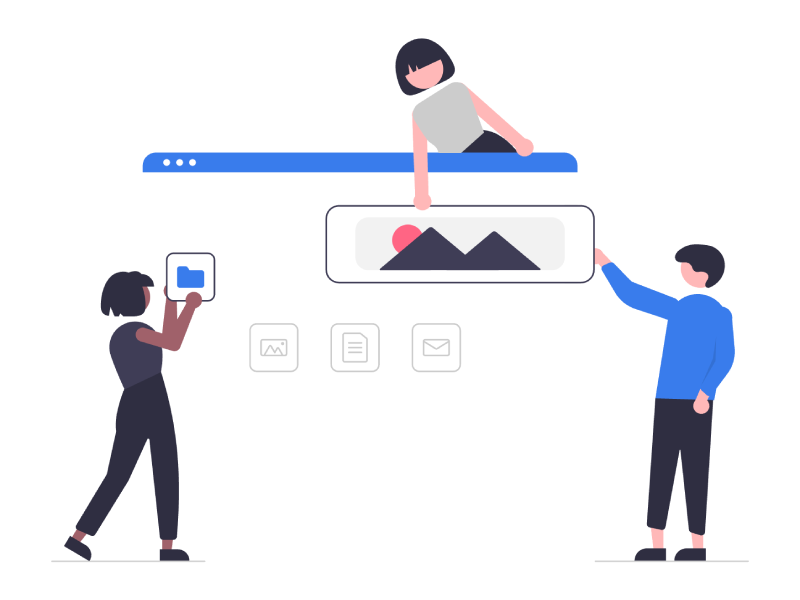
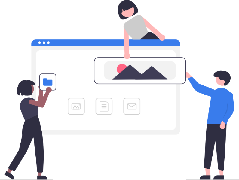
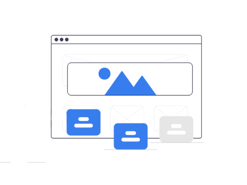
Reason #4 – Poor Navigation Structure
Even the most tantalizing website quickly exhausts goodwill if visitors can’t easily navigate to useful areas.
Complex navigation schemas spread across confusing menus cause users to bail in frustration. Ensure vital pages are reachable through simple and consistent main menus. Use breadcrumbs and even sitemaps to aid wayfinding.
On each page, ask this: “What would visitors logically need next?” Then, provide those logical links prominently. Eliminate cluttered menus or options leading nowhere. And emphasize calls-to-action that move visitors closer to conversions.
Poor information architecture comes down to putting business needs before user experience. Avoid that temptation if you want stickier visitors.
Reason #5 – Unattractive Design
Suppose a site loads fast, speaks to its audience and offers intuitive navigation. Does that guarantee visitors will stay? Shockingly no. Because another make-or-break factor is visual design quality.
While aesthetics are subjective, ugly and amateurish design reliably pushes users away. So, what exactly qualifies as bad design? Elements commonly named are:
- Clashing colors
- Unbalanced layouts
- Amateur images
- Overwhelming density
- Tiny hard-to-read font
- Dated appearance
Visitors decide if a site looks reputable, safe, and usable in milliseconds based on design. Because credible sites equal trustworthy companies in most eyes.
So, do users judge books by their covers? Absolutely. And even if you resist style concerns for pragmatism, design strongly impacts conversions and ROI.
Prioritize simple, clean layouts that clearly direct focus. Use modern designs that align with current web trends. And realize that while beauty may be only skin deep, skin gets plenty of attention.
Reason #6 – Poor Functionality
Visitor patience runs thin when websites look pretty but fail on pure usability. Brand new sites often commit functionality fumbles by:
- Burying vital actions under complex flows
- Forcing unintuitive interactions
- Failing to size tap targets for “big-size” fingers
- Neglecting keyboard and screen reader accessibility
- Breaking browser conventions like back buttons
Users arrived to complete goals – not admire kooky interfaces. So, ensure site functionality puts usability first across devices. Carefully watch testers interact with any custom elements to fix pain points. And stick to known interaction patterns unless inadequate.
Prioritizing creative flare over functionality builds beautiful ghost towns deserted by angry visitors. So, build conversions through the most usable flows – not the strangest ones.
Reason #7 – Insecure Website
You know what keeps visitors from sticking around or converting online? Fear of identity theft or hacking from websites with lax security.
Shopping cart abandonment rockets on sites lacking SSL certificates and HTTPS encryption. Because no one likes handing credit cards to shady establishments.
Recent breaches also have everyone cautious about entering personal details. Savvy users check HTTP access, scan for certifications, and probe privacy policies before engaging.
How do you build visitor confidence? Start by upgrading sites from insecure HTTP to HTTPS using SSL certificates from trusted vendors. Feature trust badges alongside robust privacy promises. Lastly, continually harden defenses and test for vulnerabilities.
When visitors arrive paranoid but leave reassured your site protects sensitive data, stickiness shoots upwards. Don’t leave security as an afterthought if you want lasting site engagement.
Reason #8 – Poor Copy
Here’s a painful truth – lackluster writing is another leading reason why visitors leave your website. Because vague, amateurish copy undermines site credibility. Worse, weak words fail to educate, excite, or inspire further action.
Yet many sites still roll out bland, generic content copied from elsewhere online. Or rely on dull corporate text choked with jargon and cliches. Both demonstrate a lack of understanding and respect for readers’ time.
But what keeps visitors actively engaged on pages?
Compelling copy. Useful advice, concrete facts, and just enough personality to feel like a conversation.
You should research users’ core questions, and pain points around topics. Then, openly address those needs through supportive messaging and a friendly, knowledgeable voice.
Of course, writing potent copy takes real work – hours of effort crafting and testing messages that truly resonate with audiences. But compelling words more than justify the investment as you forge lasting connections with your visitors.
Reason #9 – No Calls to Action
Some websites focus intensely on attraction – crafting remarkable designs, rich media, and engaging text. But after luring in visitors, they fail to present clear paths to conversion.
Without prominent calls to action, visitors struggle to recognize logical next steps tied to business goals. Did the site intend users to:
- Sign up for a webinar?
- Book a free trial?
- Download educational materials?
Too often, beautiful sites invest solely in visitor acquisition. But compelling follow-up actions matter just as much, especially for conversions.
Savvy sites explicitly link intriguing content to conversion goals using action-oriented language like “Join our waiting list” or “Add this item to your cart.” Such transparent hand-holding makes taking desired actions utterly effortless.
Don’t just hope visitors somehow convert. Place signposts immediately after content, directing them exactly how to progress further into your funnel.
Reason #10 – No Contact Info
Another factor that increases your bounce rate? Failing to collect visitor contact info for follow-up throughout the funnel.
Without grabbing emails early, websites rely on return visits to drive conversions. Yet most visitors won’t come back repeatedly without incentive. Particularly on sites they just discovered.
Wise sites balance push and pull, giving appealing reasons for visitors to voluntarily trade their contact info for lead magnets. Free trials, discounts, educational PDFs, and video courses are all ethical bribes for opening communication channels.
Savvier sites also embed multi-step funnels. Offering new reasons to share email, phone, or social handles at strategic points. Turning one-off visitors into subscribers, leads, delighted buyers, and loyal brand advocates over time through persistent outreach.
If building lasting relationships beyond a single site session matters, prioritize gathering visitor contact data early and often.
Reason #11 – No Social Proof
Lose website visitors? What if your website lacks third-party credibility indicators critical for earning trust with unfamiliar guests?
User-generated content like client testimonials, glowing case studies, and five-star reviews build belief in claims that companies can’t authentically make about themselves. Likewise, certifications by rating agencies and publications add external validation.
But too many sites present no social evidence upfront. Potential customers must accept all promises at face value. And that feels uneasy for wary visitors considering expensive commitments or sharing sensitive data.
Savvier sites embed diverse social proof immediately visible. Positive reviews, press mentions by mainstream media, and customer satisfaction awards all foster instant visitor confidence. Even subtle widgets displaying large member or subscriber counts work.
Lastly, linking to verified social media profiles signals an active listening brand that connects beyond their own website. Visitors dig deeper once assured by third parties of excellent past performance.
Reason #12 – Benefits Aren’t Clear
Some products or services struggle to share benefits because they:
- Seem inherently boring
- Feel universally known
- Get overly technical
But even “obvious” offerings must still convince visitors that the benefits justify commitments like time, attention, email addresses, or money during tight economic times.
If users aren’t clearly told how a company solves problems better than alternatives, they assume limited upside from engaging further. So, superficial perks like cost get overweighted in decision-making, sinking conversion rates.
Great messaging expresses core value in simple yet compelling terms. Use vivid details like money saved yearly or hours regained thanks to streamlined workflows. Such clarity helps visitors instantly recognize if offerings warrant subsequent steps like requesting quotes, scheduling demos, or securing trials to evaluate suitability for current needs.
Don’t rely on visitors already grasping benefits. Spelling out upsides is key to dangling the right carrot, driving engagement and conversions.
Reason #13 – Irrelevant to Searchers’ Intent
The next-to-last common reason why people leave a website is mismatching searchers’ intent. Ever Googled questions and then clicked sites seeming to offer answers only to discover they weren’t helpful? Same for us. And quick exits by disappointed searchers are devastating for traffic and conversions.
The culprit is usually content that ignores users’ true informational needs behind queries. Writers instead stuffed loose keyword synonyms semantically unrelated to the actual topic relevance at hand. Which obviously leads to users leaving a website.
For example, search “hiking preparation” to find gear checklists for upcoming adventures. If results displayed ads about financial planning packages instead, you’d bounce, too. The intention mismatch erodes any trust or goodwill instantly. Now scale that single poor experience across thousands of disengaged searchers. Ouch!
The solution lies in stepping into the shoes of searchers and understanding real situational questions behind queries. Then, provide pages laser-focused on resolving those underserved concerns through helpful advice and recommendations. See beyond keywords to perceived searcher intent if you hope to satisfy needs.
Reason #14 – Overwhelming Ads
Want the easiest way to continually annoy visitors and skyrocket the bounce rate? Mercilessly barrage people with ads everywhere they look.
Unfortunately, too many sites pursue short-term monetization gains over ideal user experience with excessive display ads and intermediary offers polluting pages. But the promised revenue rarely covers substantial losses from departing visitors.
Remember – ads already rank among the most hated aspects of web surfing.
Testing reveals even quality ads hinder site conversions by up to 40% through distraction alone. More shocking, intrusive ads can slash organic traffic by over 70% as formerly enthusiastic visitors swear off returning.
Wrap Up
So, what’s the smarter solution? Treat site attention span like valuable real estate. Be extremely selective about promotions matching audience interests and utility needs in designated locations. Offer prepurchase triggers, helping buyers make more informed decisions rather than random interruptions that mostly irritate. As you see, there are lotta reasons why users leave a website. However, the common thread is failing to build ongoing value aligned with visitor intentions. Keep optimizing pages around wants, needs, behaviors, and evolving expectations. Build loyalty and community over chasing one-off interactions. And you’ll keep earning attention rather than reflexively driving visitors away.