Let’s face it – most contact pages are boring at best and frustrating at worst. Walls of dry text, buried info, confusing forms – not exactly enticing! But here’s the surprising truth: Your website’s contact page can become one of your best sales and marketing assets. Decked out with lead-generating tools, built for SEO, and providing quick communication access, an optimized contact page keeps visitors engaged and drives conversions.
In this guide, we’ll explore exactly how to create a Contact Us page that:
- Captures attention with bold branding
- Hooks visitors with calls-to-action
- Generates leads with seamless contact
- And delights customers at every step!
Why Contact Pages Matter More Than You Think
Forget long sales pitches or splashy home page promos. For converting digital visitors, a few website elements are as valuable as an intuitive, well-designed contact page.
Here’s why it deserves way more love:
- Builds real trust – Over 50% of customers say easy contact info increases confidence in a company. Give ’em what they want!
- Multiplies leads – Conversion rates have been shown to double when users can quickly get answers from businesses. Ka-ching!
- Boosts sales – Email and form leads convert 30% better than phone inquiries. Right place, right time!
See the magic formula?
Seamless contact = more conversions.
Stop neglecting your contact page! With a few tweaks, it can become a revenue-driving machine.
Optimize Contact Page for SEO
When it comes to SEO for the contact page, we need to look at 3 key elements on good Contact Us pages:
- Metadata
- On-page content
- Schema markup
Get these right, and your contact page will be popping up in searches and catching clicks.
Craft Catchy Metadata
First impressions start before visitors even reach your page! The metadata – that snippet with the blue link in search engines – needs to grab attention.
See what we mean? That title and description preview makes or breaks if you get the click.
Here are key optimizes to shine:
Seductive Title Tags
Your title tag is the main headline searchers see for your page. Follow these rules to make it irresistible:
- Keep it under 60 characters – Truncation kills curiosity!
- Focus on crucial keywords – Especially your brand, location, and specialty.
- Catch their eye – Ask a question or highlight a benefit.
🔎 Example Contact Page SEO Title:
“Contact Us Today | Get a Free Consultation with [Company] Top Rated [Service] in [City].”
Descriptive Meta Descriptions
While not as vital as titles, compelling description meta tags still work magic:
- Aim for 150-160 characters to keep it snackable.
- Appeal to the reader and highlight value.
- Incorporate semantic keywords naturally. Don’t keyword stuff!
🔎 Example Contact Page SEO Description:
“[Company] offers caring and affordable [service] for [target customer]. Connect today for your free assessment with our friendly [location] team!”
Refresh Regularly
Don’t just set it and forget it! Update titles and descriptions seasonally for campaigns or if your offerings change.
📈 Pro Tip: Research popular questions and phrases people search for your services. Weave these into metadata for boosted clicks!
Craft Compelling On-Page Content
Each page section offers an SEO opportunity. Follow these guidelines for optimized copy:
Strong Header Tags
Properly structured H1, H2, and H3 header tags help search bots understand topics and hierarchy.
- H1 – Page heading/title
- H2 – Primary category headings
- H3 – Subheadings under categories
Scannable Layout
Let’s face it – no one wants to read walls of text anymore. Break it up!
✅ Use short paragraphs
✅ Include bulleted lists
✅ Embed relevant graphics
Link Internal Content
Cross-linking related materials helps pages share “SEO juice” within your site.
🔗 Link where it’s logical from the contact page to other top-funnel content like services, case studies, etc.
📈 Pro Tip: Don’t forget to sync key details like business name, address, and phone number to your free Google Business Profile as well. Ensuring consistency across platforms strengthens local SEO and search visibility.
Implement Schema Markup
If you want search engines to display your contact info prominently, schema markup is clutch!
Schema essentially translates page data into structured code that search bots better understand.
How to Add Schema
Many SEO plugins or web builders have schema addition “wizards” now. Look for ones that easily allow you to markup:
✅ Business name, address, phone number
✅ Location on interactive map
✅ Hours
✅ Contact form
Rich Result Benefits
Adding legit schema helps unlock a treasure trove for SEO:
💎 Knowledge panels in search
💎 Map pack results
💎 Featured snippets
By taking advantage of these benefits, your visibility goes to the next level.
Key Elements of Effective Contact Pages
We’ve set the Contact Us page SEO stage – now let’s make sure your contact page itself packs a punch!
How to create a Contact Us page? Your goal here is to build credibility, facilitate communication, and drive conversions.
No pressure or anything. 😅
Based on lots of research (and a few tears shed over lame contact pages), we’ve put together a battle-tested blueprint for contact success.
Let’s break down the key ingredients step-by-step!
Spotlight Your Business Details
Don’t make ’em hunt! Prominently showcase core information upfront:
Flaunt Your Brand
Remind visitors who you are and why they should care:
- Display recognizable logo
- Share company tagline & value proposition
- Link to the About Us page for a deeper story
Contact Info Front and Center
Plaster primary contact methods right at the top:
- Phone numbers – including international if relevant
- Multiple email addresses by department
- Physical address
- Contact form – more on this magic soon!
📝 Pro Tip: Also, link phone numbers and emails to automatically dial or populate a message. #smooth
Share Supplementary Details
A few additional useful tidbits:
- Business/licensing numbers
- Names and titles of key contacts
- Service regions covered locally
Briefly summarize everything they could want upfront!
Make Contact Crazy Easy
So they’ve landed here – don’t make getting answers a chore!
Ask How You Can Help
A warm welcome goes far to start nudging visitors closer to a conversion.
📝 Try: “How can we assist you today?” or “What brings you in?”
Provide Multiple Channels
Everyone has a preferred medium – give ’em options with:
✉️ Contact form
📞 Click-to-call buttons
📧 Email links
👥 Live chat pop-up
Document preferences or auto-save form entries if abandoned. More bang for your buck!
Share What Happens Next
A bit of hand-holding builds confidence to convert:
Explain what to expect after they submit a question or request.
📝 Example: “A member of our customer experience team will respond within 24 business hours.”
Back It Up with Social Proof
Recent studies show that most customers read reviews before contacting a local business. Don’t leave ’em guessing – flaunt what fans are saying!
Sprinkle Testimonials Throughout
Pull out meaningful excerpts praising your service and team. Include attribution details for added credibility.
★ “The techs were so friendly and fixed everything quickly!” – Mary S.
Link to Review Profiles
Don’t be shy – add badges linking out to full profiles on platforms like Google, Facebook, and Yelp.
Reviews boost trust more than anything. Let ’em browse to their heart’s content!
Complement Content with Photos
They say a picture is worth 1,000 words – and that goes double for contact pages!
Images help connect the dots between digits on a screen and real-life experiences.
📸 Show shots of:
- Company team
- Physical office spaces
- Clients being served
- Products or workspace
Style aligning with your brand visuals, of course!
Have a Heart-to-Heart
Last but certainly not least – don’t overlook the human touch. Yes, even on a digital page!
Share Your Why
What motivates your business beyond profits? Give visitors a peek behind the curtain to build rapport.
Maybe it’s:
- Commitment to craftsmanship
- Local community focus
- Industry advancement
Spotlight Your People
The faces behind the brand make it all more relatable. Introduce the key humans on screen:
- Founders
- Customer service team
- Technicians the visitor may interact with
Touting credentials doesn’t hurt while you’re at it. 😉
Additional Checklist
Well, we’ve got a few more high-performance tips that take your page from “meh” to wow:
Create a Logical Page Layout
Layout directly impacts visitor experience. Place elements strategically through design.
Guide Their Journey
Help visitors seamlessly find info and take action through:
- ↕ Structured vertical layout
- ▶ Logical eye flow
- ✨ Visual hierarchy
Emphasize Calls-to-Action
CTA placement influences conversions. Prioritize key actions by:
- 📌 Placing buttons above the fold
- Using contrasting colors
- Adding supporting icons
Reflect Brand Personality
Yes, even contact pages should align with your brand identity!
Show Visual Style
Carry over recognizable visual elements like:
- ☑ Color palette
- ☑ Logos
- ☑ Iconography
- ☑ Image framing
Match Tone of Voice
Echo your brand’s unique personality through word choices like:
- 💬 Conversational or formal
- 😊 Playful or professional
- !? Emphatic or understated
Segment Contact Channels
One form or phone number won’t cut it for all needs! Guide visitors to the right resource.
Sales Inquiries
For prospect leads looking to buy, offer:
- 📞 Click-to-call sales team
- 💌 Email link to start conversation
- 🎯 Contact form routed to CRM
Support Questions
Those needing help with services may want:
- ❓ FAQ knowledge base
- 💬 Instant chat for quick answers
- 📭 Support ticket form
General Contacts
For other administrative details, share:
- ☎ Main phone number
- ✉ General inquiries email
And link access points from the main navigation for easy discovery, too!
Link to Social Profiles
Don’t forget networks as alternate contact avenues!
Match Preferred Platforms
Understand your audience and where they connect, like:
- 🐦 Twitter for industry talk
- 👥 Facebook groups for crowdsourced tips
- ➰️ LinkedIn for professional contacts
Link Logos in Footer
Visually showcase connected platforms people can explore:
Adding widget follow buttons helps as well!
Then, cross-promote the contact page with networks for amplified impact. 📢
Contact Page Inspiration
Want some visual ideas for contact awesomeness?
Let’s check out a few standout contact page examples across industries and break down what works.
Feel free to shamelessly steal ideas for your own site! 😉
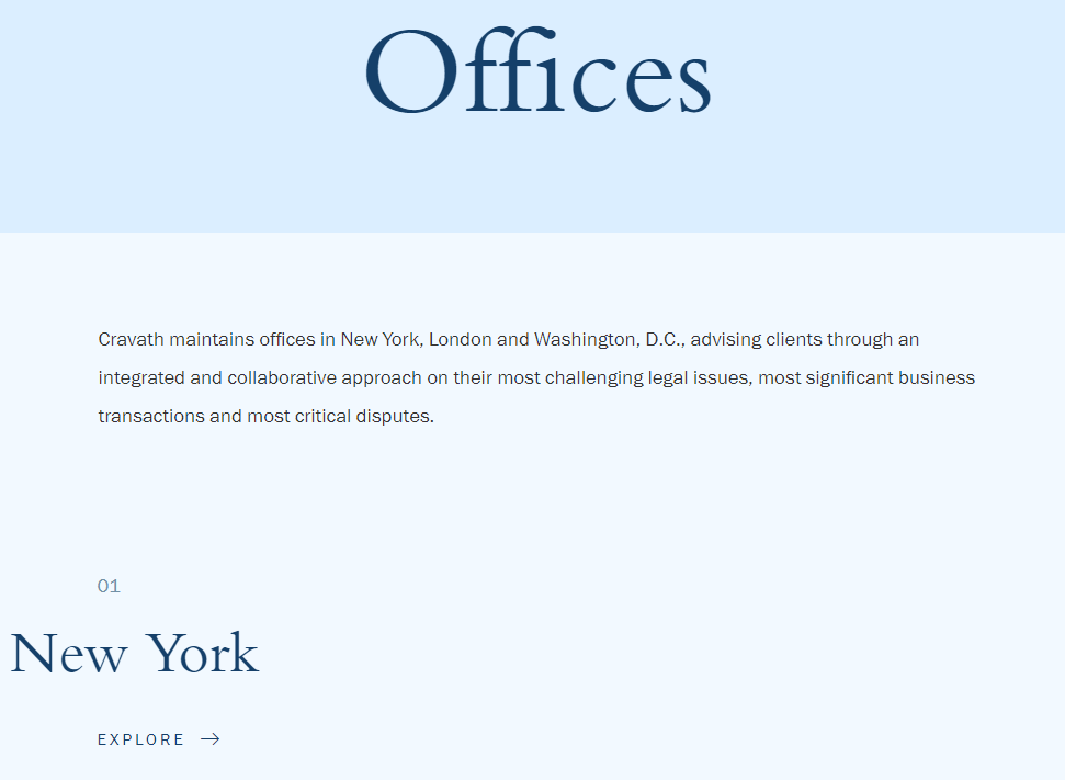
Example 1: Professional Services
Law firms need to balance professionalism with approachability on contact pages. This example nails it.
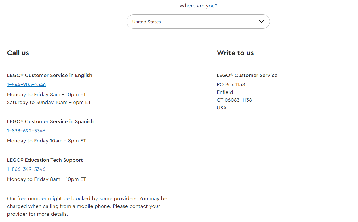
Example 2: eCommerce
Retail contact pages must enable quick shopping assistance. This store is spot on.
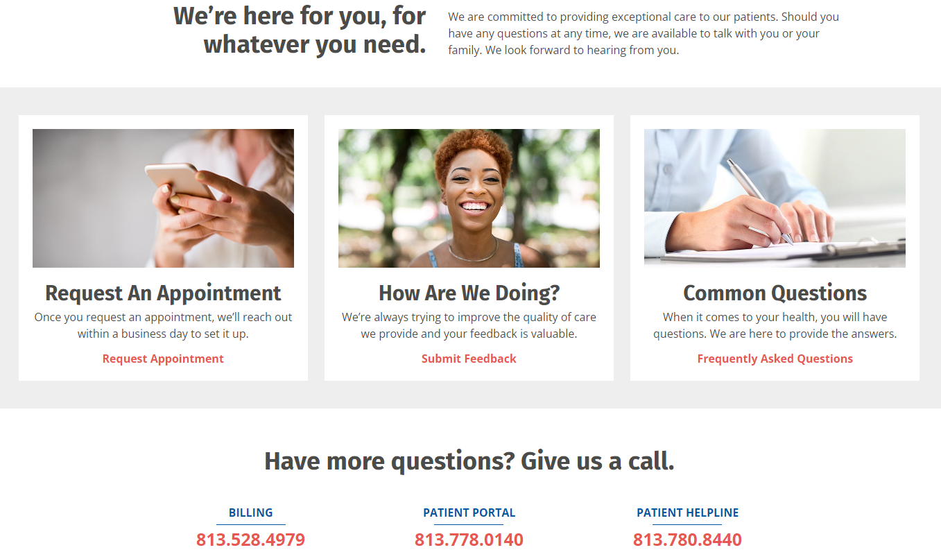
Example 3: Healthcare
For highly regulated fields like healthcare, it’s all about friendly bedside manners. This clinic does it well.
Wrap-up
With your new skills, that boring old contact page will start leveraging its full revenue-driving potential!
We know overhauling your site can feel daunting, though. So, where to start?
✅ Do one thing at a time. Pick your most needed area – maybe boosting SEO for the Contact Us page or adding a chat feature. Check it off!
✅ Collect inspiration from our Contact Us page examples and others you admire. Brainstorm how to apply your favorite elements to your industry and brand.
✅ Watch the metrics. As you optimize and enhance page components, keep an eye on lead volume, sales velocity, and ROI tracking. Analyze what moves the needle! Or deliver the job to SEO professionals. We offer comprehensive SEO audits to maximize your profits.
Piece-by-piece, you will craft an amazing contact page that converts and delights visitors!

